Which Color Brings Calm to Your Living Room?
You walk into a room and immediately feel something, before you've even had the chance to say a word. That's no coincidence: color speaks directly to your nervous system, without any involvement from conscious thought. The science behind it is surprisingly concrete, and sometimes funnily counterintuitive. Time to look at your living room through a different lens.
Blue: the color that lowers your heart rate
Blue is one of the few colors for which researchers measure effects on the body that go beyond a feeling alone: it's associated with a lower heart rate and blood pressure compared to warmer colors. This is likely rooted deep in our evolution: a blue sky or a calm body of water usually meant safety, not danger. A muted, slightly grayish blue on a wall or in textiles therefore almost never feels jarring, but rather soothing.
Green: the color your eyes struggle with the least
Green sits at the center of the visible color spectrum, which is exactly why your eye processes it with the least effort. It's also the color most strongly associated with nature, and that association alone has a measurable restorative effect: people report feeling more relaxed in spaces with plenty of green, even when there are no plants nearby. An olive-green sofa or a single green accent literally takes less effort to look at.
Your eyes have to "work" less for green than for almost any other color. Calm sometimes literally begins with what takes the least effort.
Yellow: cheerful in small doses, tiring in large ones
Yellow is universally associated with optimism and energy, and rightly so: it's the color that catches the eye fastest and appears to reflect the most light. But that's exactly why it's also the color people tire of the quickest once they see too much of it. A fully yellow wall starts to feel exhausting within a few weeks, while that same yellow in a small cushion or object still delivers that cheerful energy without taking over the room. In other words, yellow is a spice, not a main course.
Red: good for conversation, less good for relaxation
Red is the reason so many restaurants use it: it stimulates appetite and a sense of energy, and it nudges your heart rate up slightly. That's precisely why it's a less logical choice for a space where you mainly want to unwind. As an accent color, on a cushion or a small object, red keeps a conversation lively without taking over the mood. As the dominant color on a large surface, it actually works against the calm most people are looking for in their living room.
Terracotta and dusty pink: warmth without overstimulation
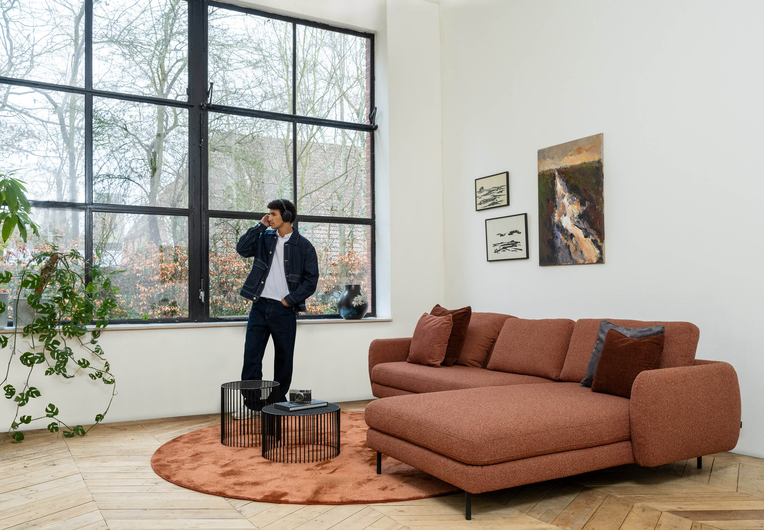
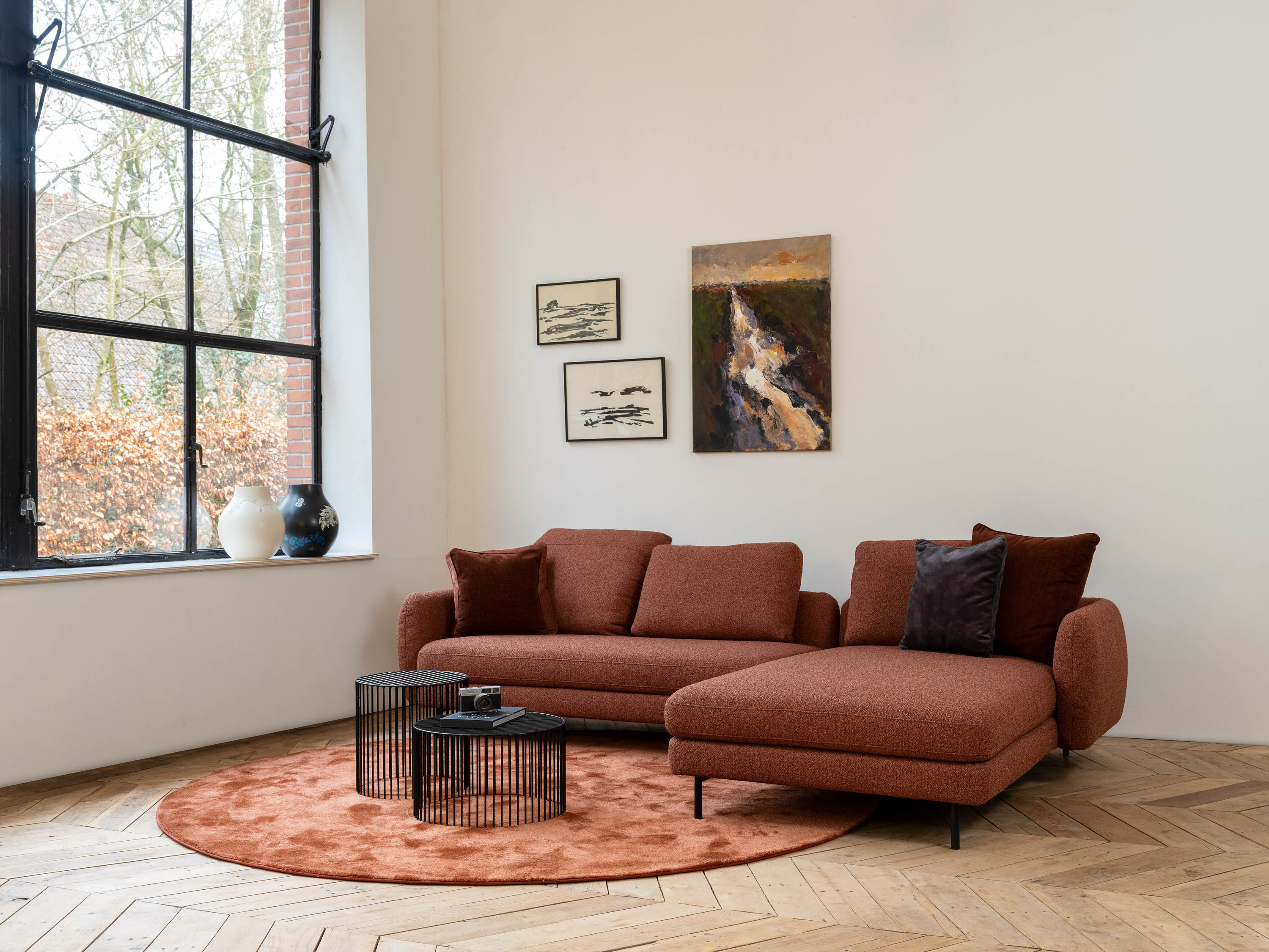
Psychologically, these shades sit in a fine middle ground: they carry the warmth of red, but without the intensity. Terracotta and dusty pink are often associated with comfort and security, without putting the body on alert the way bright red does. That makes them especially well-suited as the main color for the piece of furniture you sink into the most, exactly where you want to feel both warmth and calm.
A quick note
It's no coincidence that terracotta, ochre, and muted green are shades you'll also find in our own fabric collection: they're tones that feel warm without disrupting the calm of a space, ideal for a sofa you sink into every day.
White and neutral: calm through absence, with a catch
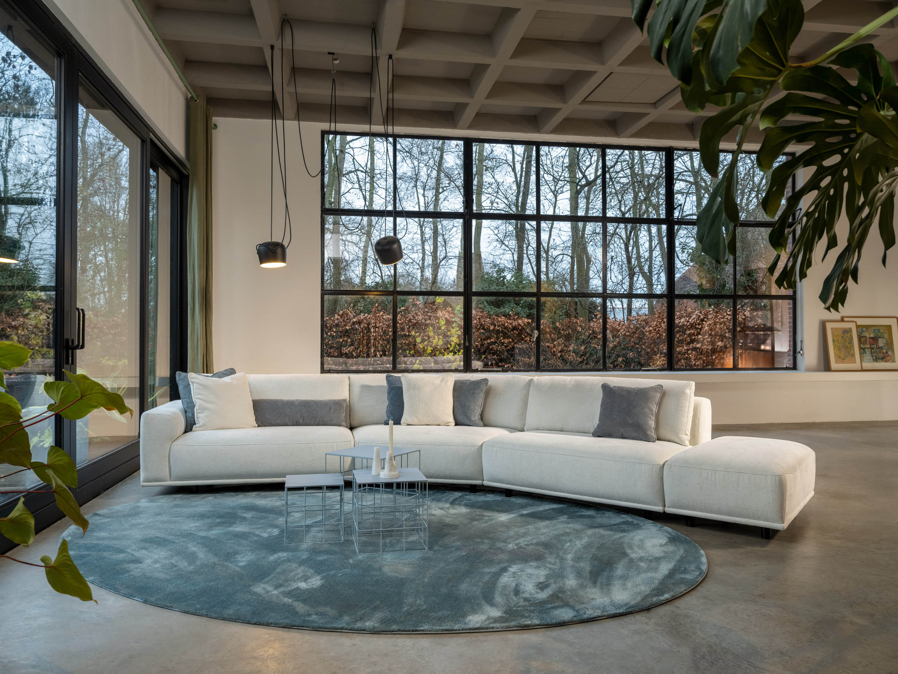
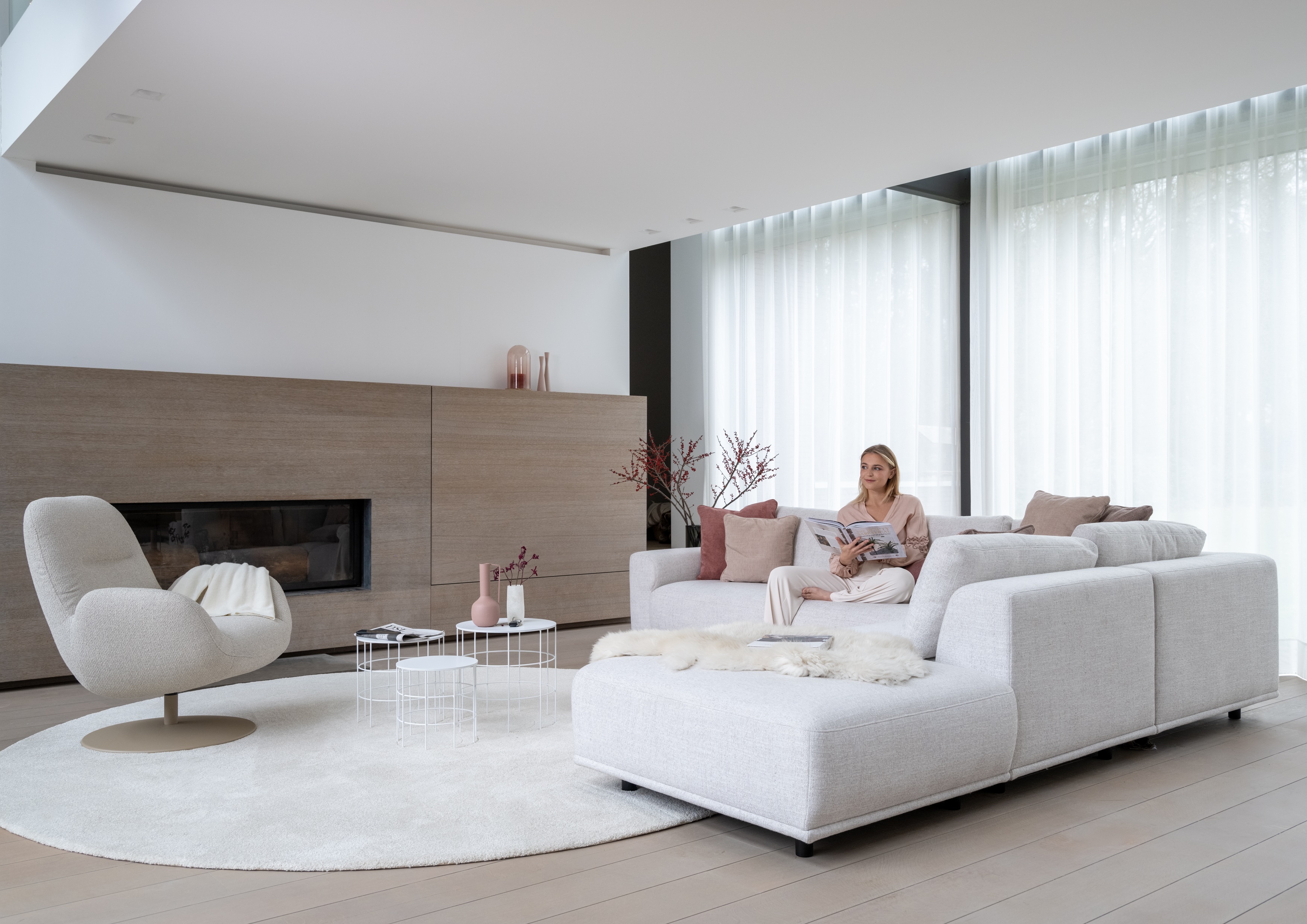
White and light neutral tones are calming simply because they give less to process. That holds true, up to a point: research on color perception suggests that completely bare, all-white spaces start to feel more clinical and cold over time rather than calming. White works best as a backdrop, not as the only color. It's the pause between the colors that actually tells your mind something.
How to combine this without overthinking it
You don't have to pick just one color. A simple rule of thumb: give the color that calms you most the largest surfaces (a sofa, a wall, a rug), and save the colors that bring energy, like yellow or red, for small accents you can look away from or swap out whenever you feel like a change. That way, your living room gets a baseline feeling of calm, with just enough energy so it never turns dull.
The result
Color is never neutral, even when we call certain shades that. Blue and green are calming, yellow and red bring energy in small doses, and terracotta and dusty pink sit right in the middle: warm enough to feel like home, calm enough to relax. The next time a room gives you a certain feeling, you'll know exactly why.